Berghall – Old Style font modernised for readability
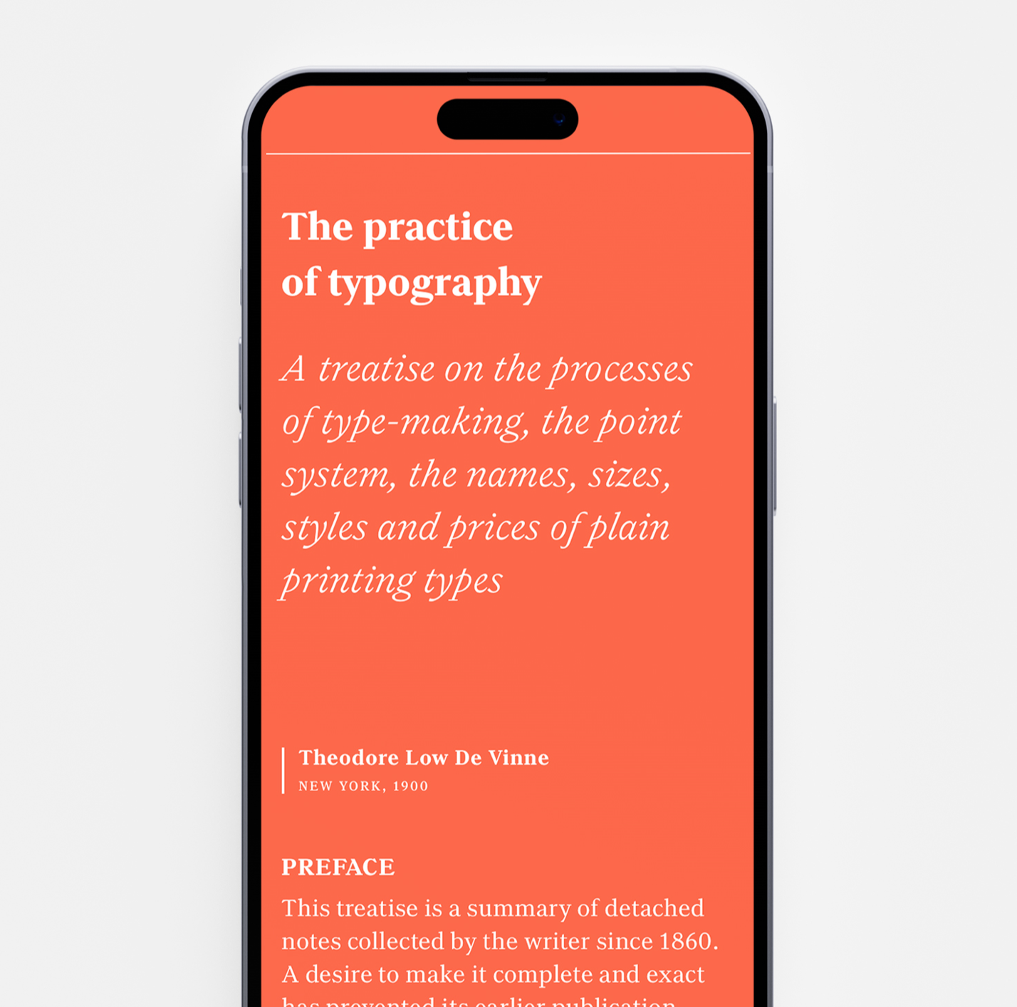
The reading process for digital products is a fragile journey through a crossfire of stimulus coming from applications competing for a reader’s attention. As a consequence, texts have been shortened in digital platforms so much that typical news articles today are only about 40–60% of their length before digital publishing began (The Guardian, 2015). Users need extra help from UX design to be able to finish their reading processes.
Still, most fonts used in digital are based on design principles developed for compact columns of newspapers or hundreds of pages of fine literature. Readability requirements for this type of media are different than on websites and apps, where text is not similarly static and heavily dominating the experience over other content types.
This is why Typolar have searched for a contemporary font design concept that is appropriate for small sized long body copy on digital narration. There are three important requirements for such a typeface. First, it must have an appeal that activates users to read text in the first place, rather than causing them drop out before starting. Second, it must match typographic readability criteria and third, comply with digital accessibility guidelines to be actually functional for reading by different readers.
Learnings from modernised Old Style fonts
The Berghall font family is inspired by a design concept first introduced in 1860s to answer the communication needs of modernised living and powered printing technology. By then, illustrations had become widely used in printing and publishers looked for fonts which will create good harmony with them in picture books and periodicals.
Text wasn’t anymore the only vehicle for the story and this changed the role of typography in modernised story narration. Typefaces didn’t have to play all roles of the play anymore – from conveying the information to guiding readers through pages and helping sustain reading. All this was now handled by a larger troupe of typography, illustration, use of space, graphics and composition of the page elements.
New font styles were developed for this purpose and they came to be known as Old Styles or more precisely modernised Old Styles (Theodor Low De Vinne 1899). These fonts combined interestingly what was considered as ‘modern’ and ‘old’ design principles. The harmonious appearance of Modern style fonts, like Bodoni, was combined with the traditional line treatment of William Caslon’s fonts from a hundred years earlier.
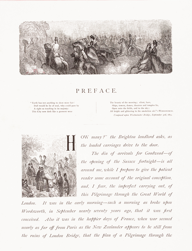
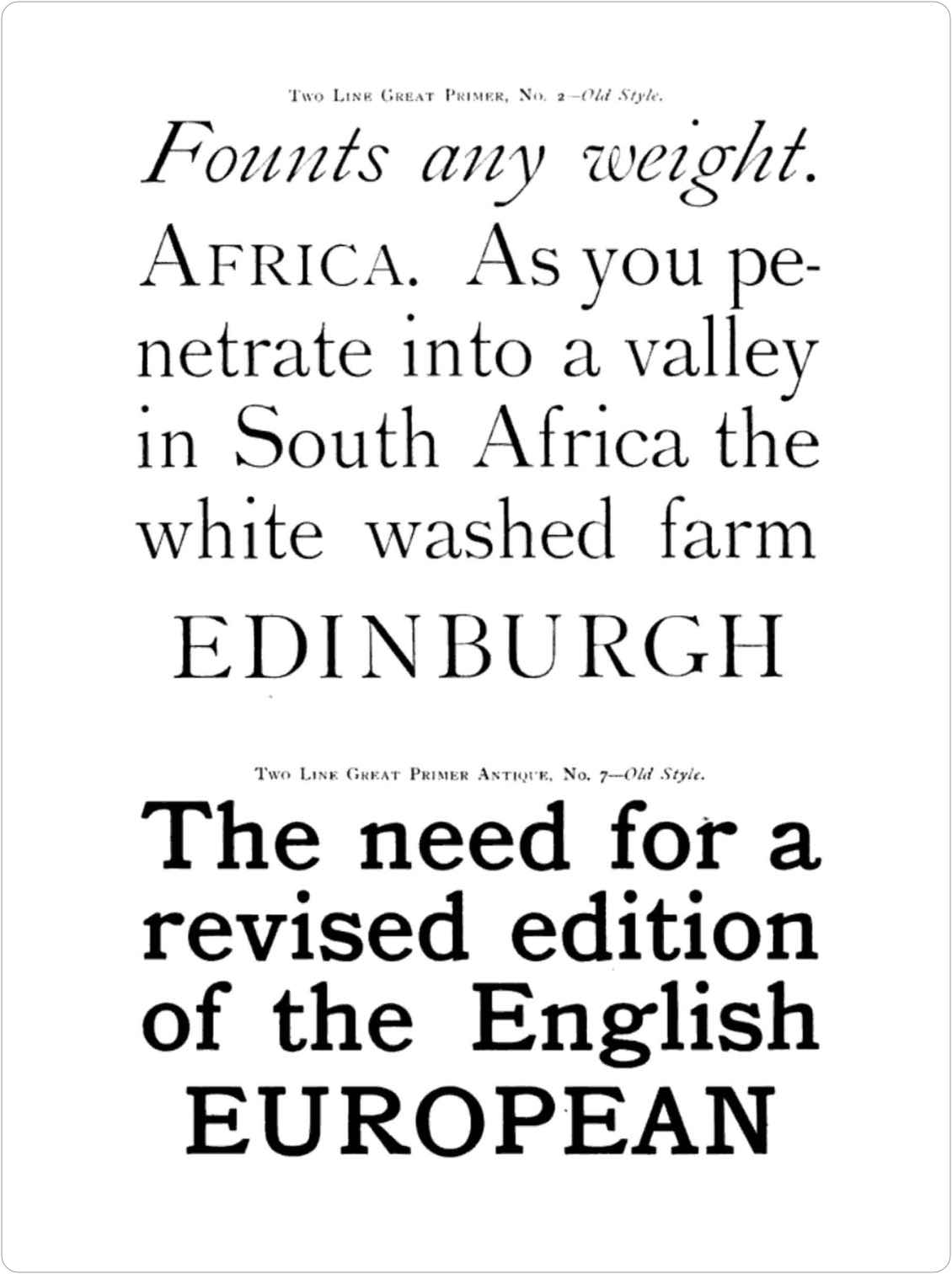
The combination of modern and traditional principles gave these new Old Style fonts an especially clear and balanced look that lacked the decoration and mannerisms associated with traditionalist fonts and book typography. This was found useful in a modernised publication design that utilised many design elements to visually structure information and support the reading process.
This new approach is clearly visible in Douglas Jerrold’s book London: A Pilgrimage, printed in 1872 with illustrations by Gustave Doré. Its layout and typography already entailes the ideas of the modernist typography, which came to revolutionise visual communication in the 20th century.
Design of the Berghall font family
The modernised Old Style has been a special source of inspiration for Berghall, especially the variation called Antique Old Style. Its strong serifs and angular line joints strove for clarity, but they also stood out in large size and caught readers’ attention in the headlines. Berghall aims for the same appeal, but with more subtile design.
Unlike Antiques, Berghall’s line treatment is more like the usual modernised Old Style. Berghall shares its light and balanced style. Carefully crafted letterforms help eyes scan the text and make reading effortless, and Berghall’s harmonic overall aesthetic helps the coherence of the general user experience in products. Yet eyes can still find many pleasureable details in the font that keep reading engaging.
By definition, Berghall is a true Serif design, meaning that the proportions of the letters and the thickness of the lines follow the design principles that originated in calligraphy and early letterpress. Such typographic qualities have been associated with ease of reading for hundreds of years in Western culture, and are still reflected in reading preferences. In comparison, many serif typefaces are created simply by adding slab serifs to sanserif forms, but such typefaces are not as effortless as true serifs for long reading.
Accessibility
In order to achieve maximum usability on digital devices, Berghall follows POUR accessibility principles in its design. Familiar and clear letterforms make Berghall easily Perceivable. Its weight ratios and clearly distinct upright and Italic styles make it intuitively Operable for the eyes and Understandable for the brain. Robust shapes remain very visible on different screen resolutions and operating systems.
